Like Agile development practices—Design Systems are quickly becoming another proven methodology woven into the fabric of the digital product process. From Finance and Energy—to Agriculture and Education; enterprise companies everywhere are reaping the cost-saving benefits of having a well-designed and maintained Design System.
But what exactly is a Design System? Why is it important to have one? How do you begin to implement and maintain one, and when should you consider building one for your organization?
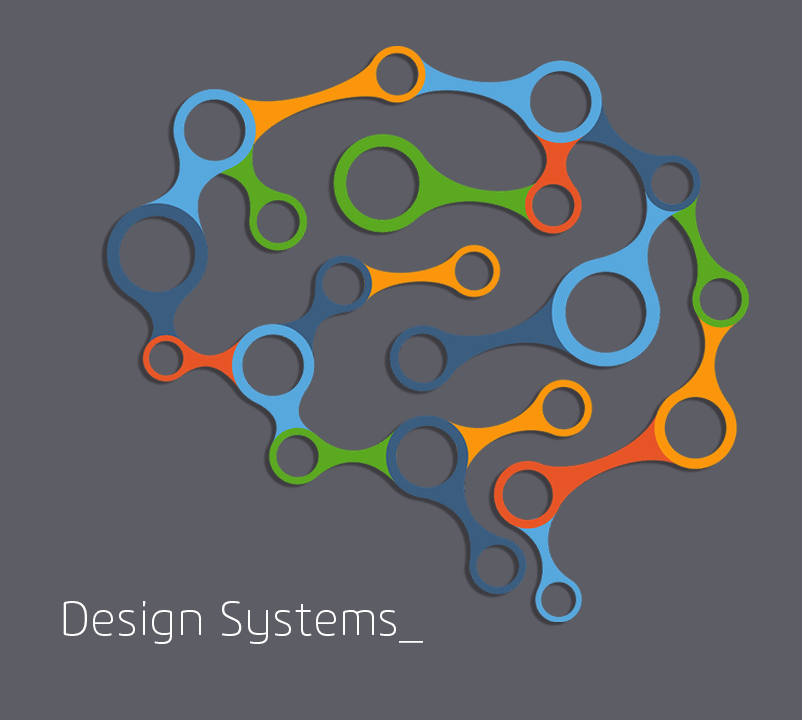
What is a Design System?
For the uninitiated, a Design System is a customized front-end framework and design language for your organization’s digital products. It ensure the development work being done looks like it was created from a single source while it may be coming from a variety of team members and departments.
A good Design System should consist of three key components:
- Style Guide
- Pattern Library
- Component Library
Each piece serves as a tool for your design and development teams to efficiently put together new digital products that are on-brand and pixel-perfectly consistent in look and feel.
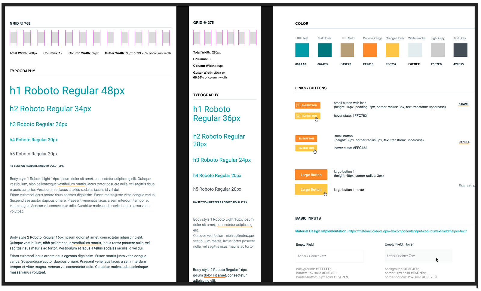
The Style Guide sits at the first level of the Design System. This is what Brad Frost refers to as 'the atomic and molecular level' in his now famous design system methodology, Atomic Design.
The Style Guide consists of all the most basic, branded elements of your digital products. Things like your color library, type definitions, and icons. The items that generally can’t be broken down into smaller items.
The Style Guide creation, documentation, and updates are maintained by the visual design team and should be created in such a way that updates are easily propagated throughout the Design System. The best way to do this is to use a shared library and a tool like Abstract that works like GitHub for designers.
The Style guide should not be confused with your brand guidelines. The brand guideline is a much higher-level document (usually created by a Marketing agency) that defines the general rules on how to visually communicate your corporate brand image. More often than not, the brand guideline isn’t designed to be easily updated or with enough details to guide digital product design. For example, the brand guidelines often don’t contain error and success colors, or hover-state colors. Sometimes they may not even support a font family that can be displayed digitally.
The Style Guide for your digital products is a deep-dive into how the brand guidelines are maintained in the digital space. It consists of all the base elements that can be put together by the design team to create the pieces within your Pattern Library.
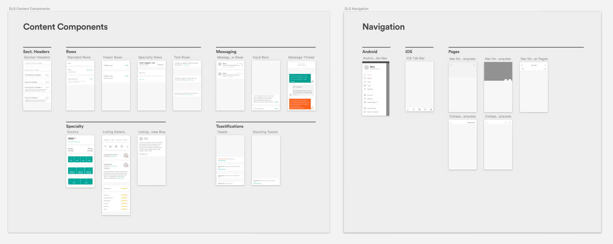
Pattern Libraries are more complex component definitions. They’re the predictably repeating, functioning parts of your product. Things like menus, modals, headers and their various state changes.
A good Pattern Library should have a well-defined naming convention for each component and should also communicate their micro-interactions and state-changes. Those are the informative animations and how elements change when triggered on hover, or on focus—and when disabled, or when activated.
The Pattern Library is also maintained by the design team. Usually in a Sketch or Figma Library so they can share them from a single source of truth and use that to design layouts quickly and consistently across all team members.
The design team will usually use the Pattern Library to design layouts for prototyping and user-testing. After validating the design, the layouts should be tagged with their style names and handed over to the front-end developer to code based on the documentation and guidelines from the Component Library.
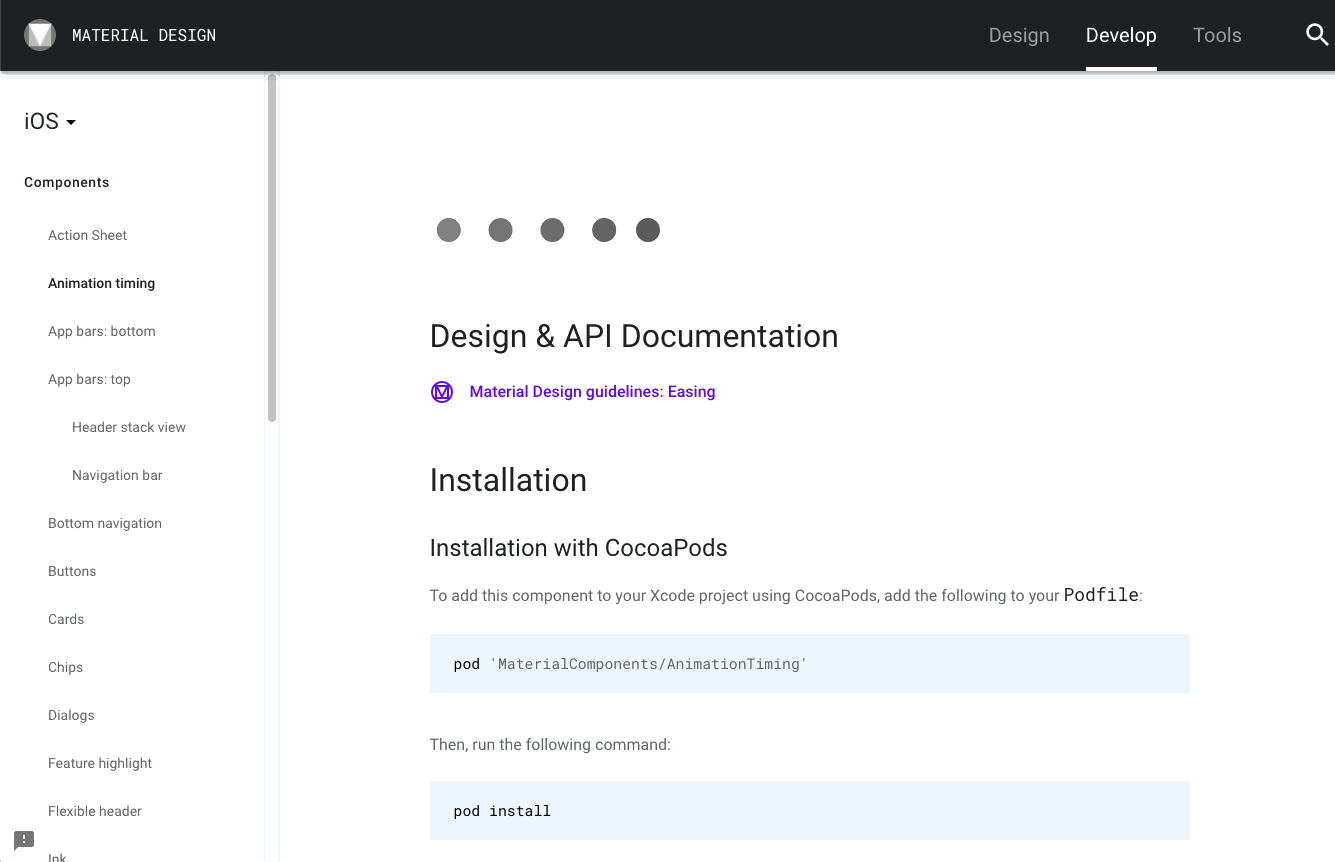
The Component Library is the code repository, built by the front-end developers based on the Pattern Library. This is where the rubber hits the road for your engineering team.
In the same way the Pattern Library helps the Designers quickly design and build prototypes, the Component Library allows the developers to quickly assemble a working page with specified style calls and code snippets. Code that has already been optimized and cleared by quality assurance.
All of these key pieces; the Style Guide, the Pattern Library and the Component Library come together to form your organizations Design System.
Should Your Company Have a Design System?
Where many organizations shy away from setting up a properly constructed Design System due to the up-front cost—those that have made the investment have discovered a more strengthened brand, faster iterations, and an unmatched ability to scale. In fact, the Nielson Norman Group has sited reports of up to 60% ROI within the first year of implementing a Design System.
If that’s not enough to convince you of the value of implementing your own Design System, consider the impact of on-boarding new designers and developers and how much more quickly they’ll be able to get up to speed on your projects. Or, how much easier your system (once established) makes design and development updates. Not just in the event of front-end rebranding, but with the front-end architecture more clearly separated from the back-end, consider the efficiency bump on your dev-ops as well.
If you’re creating a white-labelled product the value should be even more obvious. Spinning up a new instance of your B2B product can be as simple as changing colors, font definitions, and swapping out your logo assets.
The case for having a Design System can certainly be made for any digital product company but there is no doubt, if you are building more than one digital product to be maintained by a team of more than one designer and one developer, a Design System should be considered a necessity.
Getting Started with Your Design System
A design system doesn’t always need to be built from scratch. There are a lot of publicly available front-end component libraries that can be customized for your brand if need be. Bootstrap, Symantic UI, and Material by Google are some of the more commonly adapted frameworks.
But the reality of these pre-built systems if you’re building fairly complex software is that they will never be perfectly suited to your needs and will often require heavy customization. In this case, you will likely find it much more efficient and cost-effective in the long run to build your own Design System from the ground-up.
That said, if you just need to get one up and running quickly, and your if your resources are heavily taxed—then starting with a pre-built system like Bootstrap may be your best bet. Just be sure to take the time to evaluate all of your options to find a framework that will best suit your product and user needs.
Custom or not, once you’ve made the decision to build the Design System, you’ll want to treat it as a separate project and assign a dedicated team. There is a lot I could write about spinning up this project—from picking your team members to managing their utilization and the project files—but that’s best saved for a separate post.
If that’s something that would interest you, or if you’d like more information about UX in general—please leave a comment below and we'll be sure to connect with you shortly!
-3.png)


Submit a Comment