Kevin Guenther
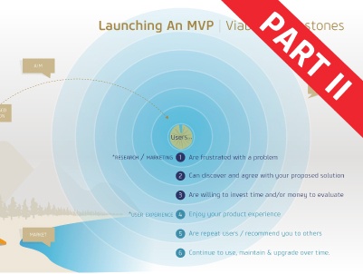
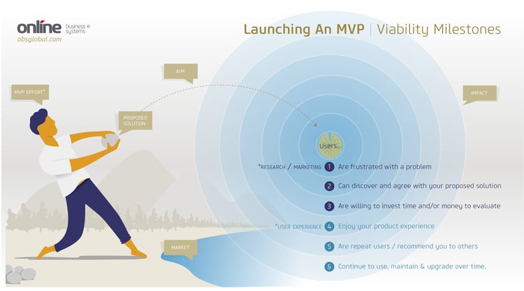
In the first part of this blog, I covered how organizations of all kinds are increasingly adopting user centered Design Thinking practices instead of dreaming up features or digital products they think their users need. I then discussed the MVP Effort, Proposed Solution, and Aim steps of the infographic below. In this final part, we will be covering viability milestones during the post-launch impact stage, including how to track the milestone's using your metrics system and what warning signs to look for that could indicate you’re not hitting all six of them.
For those who may have missed my first post, the infographic above is based on an analogy I like to use to explain what it feels like when you plan and execute a project that gets it right. The reason I like this analogy so much is because it does a great job of capturing all the feelings of preparation, practice, and eventual success I associate with lean digital product design.
Part 2. Splash Down
Impact - How did we do?
Just like throwing the stone, once you click the OK button to deploy your product live, there’s always a brief period of waiting for the results. The anticipation of watching the stone hurtle through the air is just like waiting for your social media and direct email campaign analytics, letting you know whether your aim was accurate or not.
But the real validation comes once you start to see all the sweet ripples of quantitative data rolling onto shore.
If your initial user research and your marketing messages were well considered, you’ll have already validated the need and potential market size for your product. The quality of those efforts will start rolling in first. You’ll know you’re onto something when your metrics show you they:
- Definitely have been waiting for a solution to their real-world problem or pain-point
- Have been able to find you easily enough (inbound marketing metrics)
- Show you that it’s a problem they care about by downloading or signing up for and/or installing your product to evaluate (downloads/conversions)
Points two and three are the only results you can truly get back as quantitative data, but if those two are on the rise, then it’s probably fair to infer milestone one.
Bear in mind however, if the ripples flatten out after that, you need to take a closer look at your usability metrics. If (4) users are somehow annoyed or confused by the usability of your product, or find you’re not fulfilling the promises you’ve made in your marketing materials, they (5) likely won’t return to your product or recommend you to others. Which is unfortunate because viral growth through recommendations and the like is definitely a sign you’re onto something big.
Of course, the ultimate goal you want to achieve is long-term retention, or what’s often referred to as a high Customer Lifetime Value (CLV or LTV for short). This is usually indicated by a high percentage of your users (6) downloading and installing the latest upgrades as you roll them out, but also in continued return usage.
What about the situations when you’re not designing a product for profit, but as an internal tool for employees or certified partners? While retention isn’t something you’ll have to worry about for a highly specialized, mandatory digital product—efficiency, user error, and employee happiness is certainly going to be an issue. You’ll want to gather data for those issues in that case.
Of course, with all of this juicy quantitative data, you’re also going to want to get as much qualitative data as you can. That means getting back out into the field and watching how your users interact with your product. Their mood while using it, the common distractions they have to deal with, and most importantly how they may be hacking your product or its environment to achieve their goals.
With all of this new information in-hand, you’re ready to have another go at improving your product. This is what we call the experimentation phase in product design, when your product team begins to plan an experimentation road-map. The road-map will include devising and testing various hypothesis about why something did or didn’t work, and how those issues can be fixed. Just like throwing a stone at a lily-pad in a pond, you’re first throw is probably not going to be your best and it usually takes a few shots before you get it right.
Conclusion
When considering the analogy of throwing a stone at a lily pad in a pond, it seems silly to place so much emphasis on all the activities leading up to the toss rather than focusing solely on the results of it. But just like launching (and re-launching) a new digital product or feature, the “pre-throw” is really the only part you can control, tweak, and get better at. Because as with everything else in life; the more you do it, the more adept and accurate you become. And thankfully, if you’re keeping it Lean—you’re not limited to just one stone (or just one shot at a successful launch).
Online’s Digital Studio specializes in designing and building amazing digital experiences and products. We help businesses understand their customers better and create compelling experiences through web and mobile applications that are purpose-built to deliver business results.
Want to learn more? Feel free to leave a comment below or contact us directly.


Submit a Comment